
How to Customise the Subscription Widget
The subscription widget is what customers see on your product pages. You can change its layout, its text and its look to match your store. A live preview on the right of the campaign editor updates as you go.
- The Widget tab holds the layout and the text.
- The Style tab holds colours, sizes and borders.
Set up your plans first. See How to Create a Subscription Campaign. If you start from a template, the layout and colours are already set and you can fine-tune them here. See Start a Campaign from a Template.
The cards on both tabs open one at a time. A closed card shows a short summary of its settings.
Step 1: Choose the layout
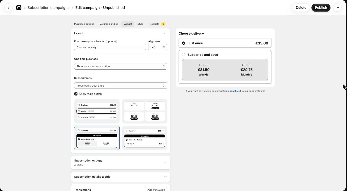
On the Widget tab, open Layout.
Purchase options header (optional): the heading above the widget. Leave it empty for no heading. Set its Alignment to Left, Center or Right.
One time purchase: how the one-time option shows.
- Show as a purchase option: a full option next to your plans.
- Show as a link button: a link under the widget. Set On click to Add to cart or Go to checkout, and the Button text.
- No one time purchase: removes it. Customers can only subscribe.
Subscriptions:
- Preselected: the option that is selected when the page loads.
- Show radio button: the round selector on each option. Not used in Minimal.
- Click a thumbnail to pick the layout:
| Layout | What customers see |
|---|---|
| Detailed | Each plan is its own row. |
| Minimal | Each plan is its own card, side by side. With 3, 6 or 9 options the cards sit three to a row, otherwise two. They stack on narrow screens. |
| Grouped toggle | All plans sit in one box. Customers switch plans with buttons. |
| Grouped dropdown | All plans sit in one box. Customers pick a plan from a dropdown. |
In the Grouped layouts the one-time purchase sits above or below the subscription box, never between plans.
Step 2: Set the option text and extras
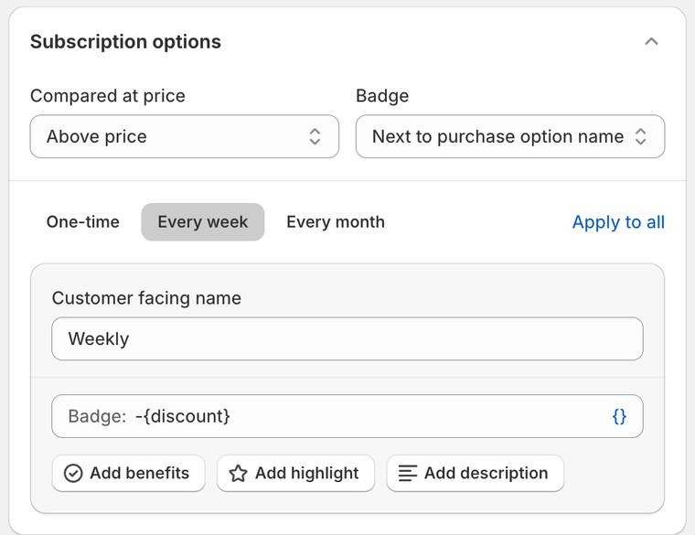
Open Subscription options. The top settings apply to the whole widget:
- Compared at price: where the crossed-out original price shows. None, Above price, Below price or Horizontal in a row. It only shows when the discount brings the price below the product price.
- Badge: where badges sit. None, Below price, Next to price or Next to purchase option name. The Grouped layouts do not offer Next to price.
In the Grouped layouts you also set:
- Box name: the heading of the subscription box, for example "Subscribe and save".
- Label above options (Grouped toggle only): a short line above the plan buttons, for example "Delivery every".
- Add highlight: one highlight label for the whole box.
Below that, click a plan's tab to edit it:
- Customer facing name: the plan name. The same field as on the Purchase options tab.
- Badge: a small label, for example "Save
{discount}". Clear it to hide the badge on that plan. - Add benefits: short lines with an icon, such as "Cancel or pause anytime". Pick an icon for each line. Tick Show only when an option is selected, collapse when not to show them only on the chosen plan.
- Add highlight (Detailed only): a highlight label on that plan, such as "Best value".
- Add description (not in Minimal): a line of text under the plan.
Click {} next to a field to insert values such as {price} or {discount}. Apply to all copies the open plan's settings to your other plans. The one-time purchase tab can also have a description.
For the wording side and translations, see Widget Wording, Translations and the Subscription Details Tooltip.
Step 3: Pick your colours
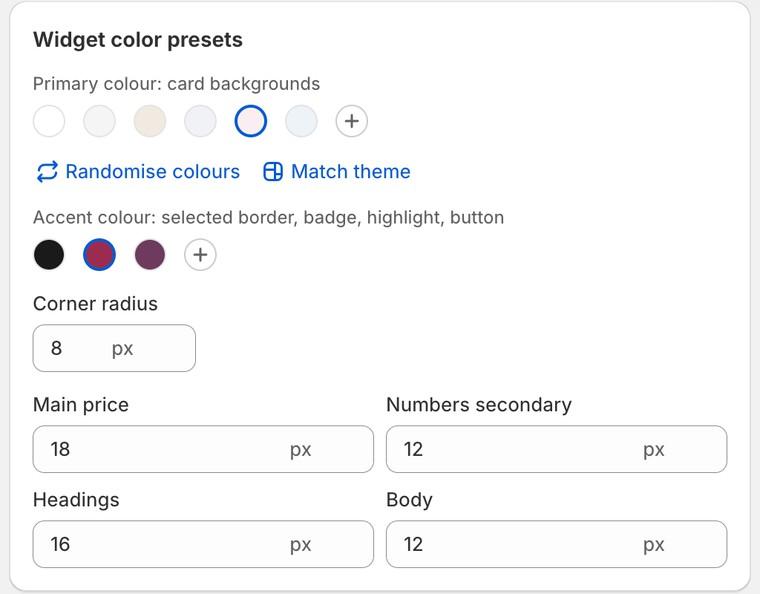
Open the Style tab. The Widget color presets card sets the whole look at once.
- Primary colour: card backgrounds: pick a swatch, or the custom swatch to enter your own colour code.
- Accent colour: selected border, badge, highlight, button: the accents on offer change with the primary colour.
- Match theme: reads the colours of your live theme and applies them. Click it again to try the next accent from your theme.
- Randomise colours: tries a random combination.
- Corner radius: how rounded the boxes are, in pixels.
- Text sizes in pixels: Main price, Headings, Body, and Numbers secondary when a crossed-out price is shown.
Picking a swatch overwrites the colours you set in the cards below.
Step 4: Fine-tune each part
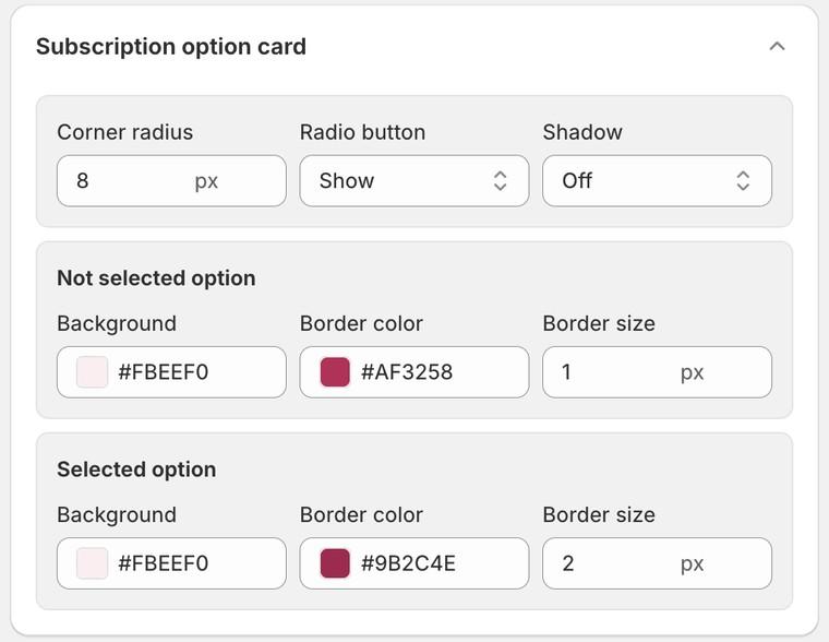
The cards under the presets style one part of the widget each. You only see cards for the parts your widget uses:
- Text above the widget
- Subscription option card (Grouped: Subscription card): background, border, corner radius and shadow, with separate settings for the selected option. Radio button show or hide is here too.
- Delivery options (Grouped only)
- Badge
- Purchase option text
- One time purchase, or One time purchase text when it shows as a link
- Price: the price and the strike through price
- Description text
- Benefits
- Highlight
- 1st order gift, when a plan has a gift
Text settings are Size, Style (for example Regular or Bold) and Color, with a Selected color for the chosen option where it applies. Box settings are Background, Border color, Border size, Corner radius and Shadow.
If the campaign has volume bundles, the Layout card gets bundle settings, the Widget tab gets a Bundle options card, and the Style tab gets Bundles card, Bundles text and Bundles price. See How to Set Up Volume Bundles.
Step 5: Custom CSS (advanced)
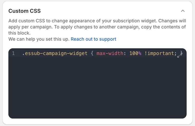
If you need something the built-in settings don't cover, open the Custom CSS card at the bottom of the Widget tab and add your own rules. Every class in the widget starts with essub-, for example .essub-campaign-widget for the whole widget. Use the expand icon for a bigger editor.
Custom CSS is saved per campaign. If you have several campaigns, copy the block into each one.
The two rules merchants ask for most, full width and hiding the details icon, are in Subscription Widget Not Showing? Checklist and Placement and Widget Wording, Translations and the Subscription Details Tooltip. If you would rather not write CSS, contact support and we will do it for you.
Saving and publishing
A save bar appears at the top whenever you have unsaved changes. Save to keep them, or click Publish to make the campaign live. See How to Create a Subscription Campaign.
Note: the preview starts with a Sample product and example prices. To see a real price, click Sample product above the preview and pick one of your products. See Why is the price in the app preview different from my store?.